Jefferson Lab Site Tour
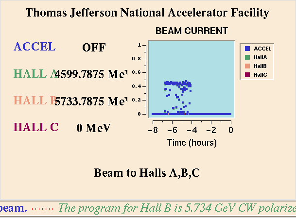
Machine Control Center - Last 8 Hours Graph
This graph shows what the accelerator has been doing over the last eight hours. Time is measured on the x-axis (horizontal axis) and current is measured on the y-axis (vertical axis). The points on the graph are color coded according to the text to the left of the graph.
This tour reflects Jefferson Lab as it was in the late 1990s and early 2000s. In particular, this predates the 12 GeV upgrade and the addition of Hall D. For a modern look at the Lab, please see the Jeffeson Lab Virtual Tour.
Citation and linking information
For questions about this page, please contact Education Web Administrator.

